Document Actions reference
Add custom operations to documents.
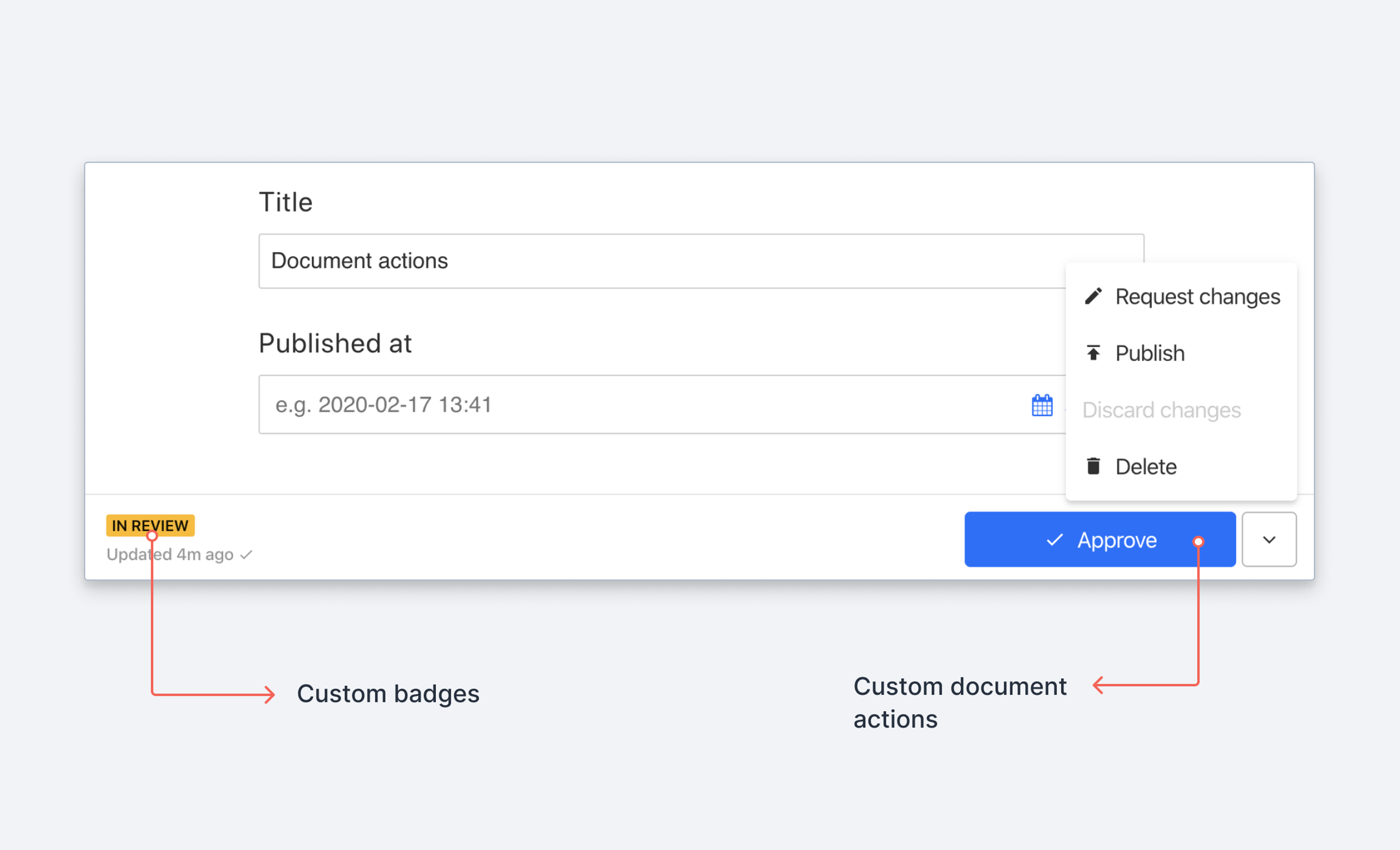
You can use the Document Actions API for Sanity Studio to customize and control operations that can be done to documents. When you create a custom action, it will be available in the actions menu in the document editor. You create custom actions by adding a DocumentActionComponent to the document.actions array of your workspace configuration.
Learn how to create custom workflows with the Document Actions API.
document.actions accepts either a static array of document action components or a callback function returning the same. When supplied with a static array, Sanity Studio will append your actions to the list of already existing actions.
Protip
Sanity Studio comes with a set of predefined document actions enabled that are helpful for manipulating documents. These are:
- Publish
- Unpublish
- Delete
- Duplicate
- Discard changes
- Restore to history state
You are free to swap any or all of these out with your own custom actions, or conditionally disable or enable them in your studio configuration.
import {CustomAction} from './actions'

export default defineConfig({
  // ...rest of config
  document: {
    actions: [CustomAction],
  },
})
In contrast, when using the callback method, you will need to make sure you return the exact set of actions you want to register. Helpfully, the callback function receives the current array of registered action components as its first argument and a context object as its second and final argument.
import {HelloWorldAction} from './actions'

export default defineConfig({
  // ... rest of config
  document: {
    actions: (prev, context) => {
      // Only add the action for documents of type "movie"
      // for other types return the current array of actions as is
      return context.schemaType === 'movie' ? [HelloWorldAction, ...prev] : prev;
    },
  },
})
Callback context properties
currentUser
object | CurrentUser
An object containing information about the currently logged in user
schemaType
string
Schema type of the current document
dataset
string
Name of the dataset
projectId
string
Unique ID of the project
getClient
function
Returns a configured SanityClient
documentId
string
ID of the document
schema
object | Schema
The schema registry of your project. Use `schema.get("schemaTypeName") to retrieve any schema by name.
Example
document: {
    actions: function (prev, context) {
      console.log('context: ', context);
      return prev.map((originalAction) => (originalAction.action === 'publish' ? HelloWorldAction : originalAction));
    }
  },
Document Action components
This table describes the values a document action component receives as properties (DocumentActionProps):
Properties
id
string
The current document’s
id.type
string
The schema type of the current document.
draft
SanityDocument
The draft document (e.g. unpublished changes) if any.
Returns
nullif there are no unpublished changes.published
SanityDocument
The version of the document that is currently published (if any).
Returns
nullif the document isn't published.liveEdit
boolean
Whether the document is published continuously (live) or not. liveEdit-enabled documents skip the draft workflow. This is not to be confused with the Live Content API, which handles how published changes are handled by queries.
Identifying built-in actions
Built-in document action components have an optional action property that identifies which built-in action they represent. Use this to selectively replace or extend a specific action:
The action property uses values like 'publish', 'delete', 'duplicate', 'unpublish', 'discardChanges', and 'restore'. Custom actions don't have this property unless you set it.
Document Action description
Every Document Action component must return either null or an action description object (DocumentActionDescription). An action description describes the action state that can be used to render action components in different render contexts (e.g. in a toolbar, as a menu item, etc.). This table describes the different properties of an action description object.
Requiredlabel
string
This is the action label. If the action is displayed as a button, this is typically what becomes the button label.
RequiredonHandle
void
This allows the action component to specify a function that gets called when the user wants the action to happen (e.g. the user clicked the button or pressed the keyboard shortcut combination). The implementation of the
onHandlemust either make sure to start the dialog flow or to execute the operation immediately.icon
React Element
In render contexts where it makes sense to display an icon, this will appear as the icon for the action. Default is
nulldisabled
boolean
This tells the render context whether to disable this action. Default is
false.shortcut
string
A keyboard shortcut that should trigger the action. The keyboard shortcut must be compatible with the format supported by the is-hotkey-package.
title
string
A title for the action. Depending on the render context this will be used as tooltip title (e.g. for buttons it may be passed as the title attribute). Default is
null.dialog
ConfirmDialog | PopOverDialog | ModalDialog
If this is returned, its value will be turned into a dialog by the render context. More about dialog types below. Default is
null.group
Array<'default' | 'paneActions'>
Allow users to specify whether a specific document action should appear in the footer ("default") or in the document's context menu ("paneActions").
tone
ButtonTone
Allows changing the tone of the action when displayed.
Document Action dialog types
Dialogs can notify and inform users about the outcome of an action, or they can collect confirmation before executing the action. You can define the following dialog types:
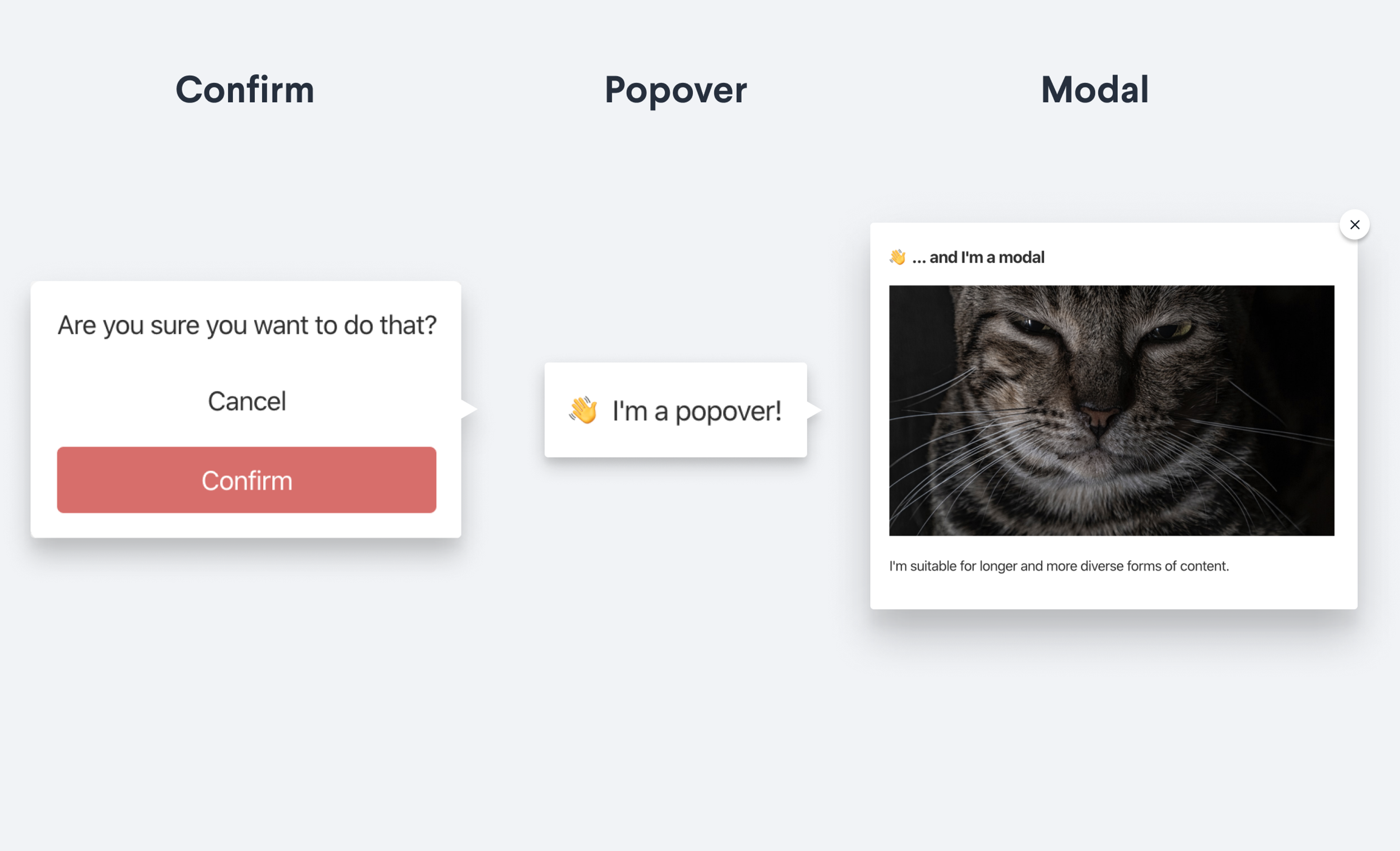
confirm
This tells the render context to display a confirm dialog. See the DocumentActionConfirmDialogProps reference for the full type definition.
Properties
type
string
Must be
confirm.color
string
Support the following values
warning,success,danger,info.message
string | React.ReactNode
The message that will be shown in the dialog.
onConfirm
function
A function to execute when the the user confirms the dialog.
onCancel
function
A function to execute when the user cancels the dialog.
Example
export function ConfirmDialogAction() {
  const [dialogOpen, setDialogOpen] = React.useState(false)
  return {
    label: 'Show confirm',
    onHandle: () => {
      setDialogOpen(true)
    },
    dialog: dialogOpen && {
      type: 'confirm',
      onCancel: () => {
        setDialogOpen(false)
      },
      onConfirm: () => {
        alert('You confirmed!')
        setDialogOpen(false)
      },
      message: 'Please confirm!'
    }
  }
}
popover
This will display the value specified by the content property in a popover dialog (DocumentActionPopoverDialogProps). The onClose property is required, and will normally be triggered by click outside or closing the popover.
Example
export function PopoverDialogAction() {
  const [dialogOpen, setDialogOpen] = React.useState(false)
  return {
    label: 'Show popover',
    onHandle: () => {
      setDialogOpen(true)
    },
    dialog: dialogOpen && {
      type: 'popover',
      onClose: () => {
        setDialogOpen(false)
      },
      content: "👋 I'm a popover!"
    }
  }
}
dialog
This will display the value specified by the content property in a dialog window (DocumentActionModalDialogProps). The onClose property is required.
Example
export function ConfirmDialogAction() {
  const [dialogOpen, setDialogOpen] = React.useState(false)
  return {
    label: 'Show confirm',
    onHandle: () => {
      setDialogOpen(true)
    },
    dialog: dialogOpen && {
      type: 'dialog',
      onClose:  () => {
        setDialogOpen(false)
      },
      content: <div>
        <h3>👋 ... and I'm a dialog</h3>
        <img src="https://source.unsplash.com/1600x900/?cat" style={{width: '100%'}}/>
        <p>
          I'm suitable for longer and more diverse forms of content.
        </p>
      </div>
    }
  }
}
custom
This will display the value specified by the component property in a custom dialog window. The onClose property is required.
Example
import {Button, Card, Dialog, Stack, Text} from '@sanity/ui'

export function CustomDialogAction() {
  const [dialogOpen, setDialogOpen] = React.useState(false)
  const toggleOpen = () => setDialogOpen(state => !state)
  return {
    label: 'Custom modal',
    tone: 'primary',
    onHandle: toggleOpen,
    dialog: {
      type: 'custom',
      component: open && (
        <Dialog
          header="Custom action component"
          id="custom-modal"
          onClickOutside={toggleOpen}
          onClose={toggleOpen}
          width={1}
          footer={
            <Stack padding={2}>
              <Button onClick={toggleOpen} text="Close" />
            </Stack>
          }
        >
          <Card padding={5}>
            <Text>This dialog is rendered using a custom dialog component.
            </Text>
          </Card>
        </Dialog>
      ),
    }
  }
}
Action ordering and overflow
Document actions render as one primary button plus all other actions in an overflow menu (the Actions dropdown). The split is fixed: there is no way to show multiple primary buttons simultaneously, and the overflow threshold is not configurable.
Ordering
By default, the built-in Publish action is first in the array and renders as the primary button. Actions appear in the order they are returned from your document.actions resolver. The first element becomes the primary button; subsequent elements appear in the overflow menu in array order. There is no priority, weight, or order property on DocumentActionDescription.
Promote a custom action to the primary button
Return your action first in the array. The actions that follow appear in the overflow menu in the order they are returned:
import {defineConfig} from 'sanity'
import {HelloWorldAction} from './actions/HelloWorldAction'

export default defineConfig({
  // ...
  document: {
    actions: (prev, context) => {
      // Put your custom action first so it becomes the primary button
      return [HelloWorldAction, ...prev.filter((a) => a !== HelloWorldAction)]
    },
  },
})
When the primary button is suppressed
In some contexts, no action is promoted to the primary button and all actions appear in the overflow menu instead:
- When viewing a historical revision of the document.
- When the document type uses
liveEditand no version is selected.
In a release context, when the first action in your array is a built-in Sanity-defined action.
Schedule publish promotion
When a document has a paused scheduled publish, the Schedule action is automatically promoted to the primary button, even if it is not first in your actions array. This is intentional, to keep paused schedules visible at the top level.
group vs ordering
The group property on a DocumentActionDescription ('default' or 'paneActions') controls which surface the action appears on (toolbar versus document context menu), not its order or whether it is primary. Ordering rules apply within each group.