String
A schema type for strings and a selectable lists of strings.
Short string. Typically used for titles, names, and labels. If you need a basic multi-line string input, use the text. If you need text with markup and structured data, use block. See the StringDefinition reference for the full type definition.
Properties
Requiredtype
Required. Value must be set to
string.Requiredname
Required. The field name. This will be the key in the data record.
title
Human readable label for the field.
If set to
true, this field will be hidden in the studio. You can also return a callback function to use it as a conditional field.readOnly
If set to
true, this field will not be editable in the content studio. You can also return a callback function to use it as a conditional field.description
Short description to editors how the field is to be used.
initialValue
The initial value used when creating new values from this type. Can be either a literal string value or a resolver function that returns either a literal string value or a promise resolving to the initial string value.
deprecated
Marks a field or document type as deprecated in the studio interface and displays a user-defined message defined by the single required
reasonproperty.If you deploy a GraphQL API schema, this property will translated into the
@deprecateddirective.icon
Supply a custom icon for this field. See icons documentation for more information.
components
Lets you provide custom components to override the studio defaults in various contexts.
placeholder
Placeholder text shown in the input when it has no value.
Options (StringOptions)
list
A list of predefined values that the user can choose from. The array can either include string values
['sci-fi', 'western']or objects[{title: 'Sci-Fi', value: 'sci-fi'}, ...].String values will automatically be made uppercase in the Studio. To prevent this, use object values instead.
layout
Controls how the items defined in the
listoption are presented. If set to'radio'the list will render radio buttons. If set to'dropdown'you'll get a dropdown menu instead. Default isdropdown.direction
Controls how radio buttons are lined up. Use
direction: 'horizontal|vertical'to render radio buttons in a row or a column. Default isvertical. Will only take effect if thelayoutoption is set toradio.
Dropdown empty option
When layout: 'dropdown' is set on options.list, the input renders a blank option at the top of the list representing the unset state. Selecting it clears the field's value. This blank option is built into the dropdown input and cannot be removed, renamed, or restyled through schema configuration.
What schema configuration can and cannot change:
- Cannot remove the blank option:
required()validation,initialValue, and none of the availableoptionsfields remove it from the rendered list. - Cannot rename the blank option: its title is hardcoded to an empty string.
- Can switch to
layout: 'radio': radio layout does not include a blank option. - Can implement a custom input component: for full control over placeholder text, empty-option behavior, and item rendering.
Workarounds
Use radio layout: switch from layout: 'dropdown' to layout: 'radio' to avoid the blank option entirely. This is the simplest schema change:
defineField({
  name: 'status',
  type: 'string',
  options: {
    list: ['draft', 'published', 'archived'],
    layout: 'radio',
  },
})
Custom input component for full control: for full control over rendering, including placeholder text and conditional logic, implement a custom input. See Create a visual string selector field input.
Dynamic option lists
The options.list property only accepts a static array of strings or {title, value} objects. It does not accept a function or callback, and TypeScript catches this at compile time. If you need a dynamic list (filtered by another field, fetched at runtime, conditionally shown), implement a custom input component.
Register a custom input on the field, then build the option list inside your component. Use useFormValue to read other fields on the current document, or fetch data through @sanity/client. For an example of the custom input pattern, see Create a visual string selector field input.
import {defineField} from 'sanity'
import {DynamicStatusInput} from './DynamicStatusInput'

defineField({
  name: 'status',
  type: 'string',
  components: {
    input: DynamicStatusInput,
  },
})
Dynamic options.list support is tracked in GitHub issue #4095.
Validation (StringRule)
required()
Ensures that this field exists.
min(minLength)
Minimum length of string.
max(maxLength)
Maximum length of string.
length(exactLength)
Exact length of string.
uppercase()
All characters must be uppercase.
lowercase()
All characters must be lowercase.
email()
Value must be a valid email-address.
regex(pattern[, options])
String must match the given pattern.
optionsis an optional object, currently you can setoptions.nameandoptions.invert.Providing a
namewill make the message more understandable to the user ("Does not match the <name>-pattern").Set
inverttotruein order to allow any value that does NOT match the pattern.custom(fn)
Creates a custom validation rule.
error(message)
Sets a custom error message for the preceding validation rule.
warning(message)
Sets a custom warning message for the preceding validation rule. Warnings do not prevent publishing.
info(message)
Sets a custom info message for the preceding validation rule. Info messages are purely informational and do not prevent publishing.
valueOfField(path)
Gets the value of a sibling field to use in validation. Useful for creating validation rules that depend on the value of another field.
Examples
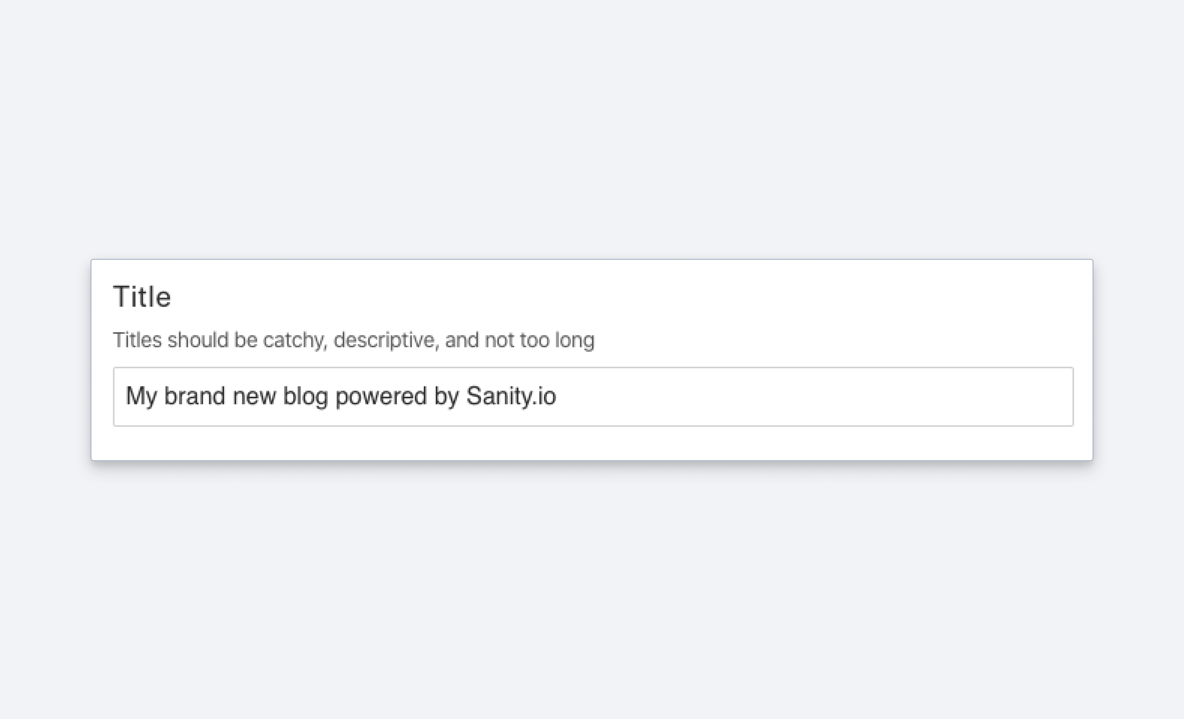
Field configuration
{
  title: 'Title',
  name: 'title',
  type: 'string',
  description: 'Make it catchy',
  validation: Rule => Rule.max(120).warning(`A title shouldn't be more than 120 characters.`)
}
List of predefined strings
Input
{
  title: 'Genre',
  name: 'genre',
  type: 'string',
  options: {
    list: [
      {title: 'Sci-Fi', value: 'sci-fi'},
      {title: 'Western', value: 'western'}
    ], // <-- predefined values
    layout: 'radio' // <-- defaults to 'dropdown'
  }
}
Response
{
  "_type": "movie",
  "_id": "23407q-qwerqyt12",
  "genre": "sci-fi",
  ...
}
Protip
Want to make a multi-select for strings? Check out the Array schema type to see how you can build an array of strings, references, objects, and more.
For details on how to access the title value of a list in your document list preview, please see the documentation on previewing from predefined string lists.
Setting initial value for string fields
You can use initial values to preset string fields on document creation:
export default {
  name: 'post',
  type: 'document',
  title: 'Post',
  initialValue: {
    title: 'The initial title'
  },
  fields: [
    {
      name: 'title',
      type: 'string',
      title: 'Title'
    }
  ]
}